



I still remember the first time I used macOS and noticed the Dock. It felt smooth, visual, and intuitive. For years, Windows users relied on the taskbar instead. Now, with recent updates and design shifts in Windows 11, I can confidently say this: Windows finally behaves like it has a dock experience.
But let’s clear something up right away. Microsoft has not officially renamed the taskbar as a “Dock.” Instead, it has redesigned the taskbar to function like one. And that subtle shift changes how we use Windows daily.
In this article, I’ll break down what this “dock-like” experience means, how it works, what’s new, and whether it actually improves productivity.
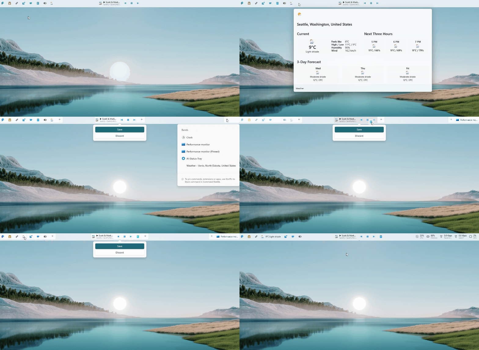
What Do We Mean by “Windows 11 Has a Dock”?
When I say Windows 11 has a dock, I’m referring to the centered, app-focused taskbar that behaves visually and functionally like a dock.
Here’s what changed:
- Icons are centered by default
- Apps stay pinned and visually consistent
- Running apps show subtle indicators
- Animations feel smoother and more modern
- The overall design focuses on simplicity and accessibility
This approach closely resembles the dock seen in macOS. Microsoft did not copy it blindly, but they clearly took inspiration.
Why Microsoft Changed the Taskbar
Microsoft redesigned the taskbar for a reason. They wanted Windows to feel modern, clean, and easier to use across devices.
According to Microsoft’s official design documentation, Windows 11 focuses on three principles:
- Simplicity
- Productivity
- Consistency across devices
Source: Microsoft Design Principles
https://learn.microsoft.com/windows/apps/design/
When I use Windows 11, I notice this shift immediately. The interface feels less cluttered. The taskbar no longer overwhelms me with too many visual elements.
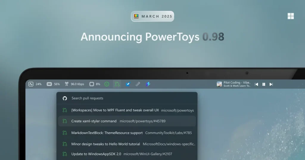
Key Features of the New Dock-Like Taskbar
Let me walk you through what actually makes this feel like a dock.
1. Centered Icons
This is the most obvious change.
Instead of starting from the left, icons now sit in the center of the screen. This improves accessibility, especially on large monitors.
Why it matters:
- Reduces mouse travel distance
- Keeps focus in the center of your workflow
- Looks cleaner and more balanced
If you prefer the old layout, you can still move icons back to the left. Microsoft did not force this change completely.
2. Pinned Apps Work Like a Dock
Pinned apps behave almost exactly like a dock now.
I can:
- Pin frequently used apps
- Rearrange them easily
- Launch apps with one click
- Keep my workspace consistent
This mirrors how users interact with docks in other operating systems.
3. Subtle Running Indicators
Windows 11 uses small lines under icons to show active apps.
This small design tweak improves clarity. I can quickly see what’s open without distractions.
It may sound minor, but it reduces cognitive load. And that matters when you multitask.
4. Improved Animations
Animations in Windows 11 feel smoother.
Opening apps, switching windows, and minimizing programs all use refined motion design.
Microsoft confirmed this shift toward fluid design:
Source: Microsoft Fluent Design System
https://learn.microsoft.com/windows/apps/design/style/fluent-design-system/
From my experience, these animations make the system feel faster, even when performance stays the same.
5. Touch and Tablet Optimization
The dock-like taskbar also works better on touch devices.
Windows 11 increases spacing between icons. This makes tapping easier and more accurate.
This aligns with Microsoft’s push toward hybrid devices like Surface laptops.
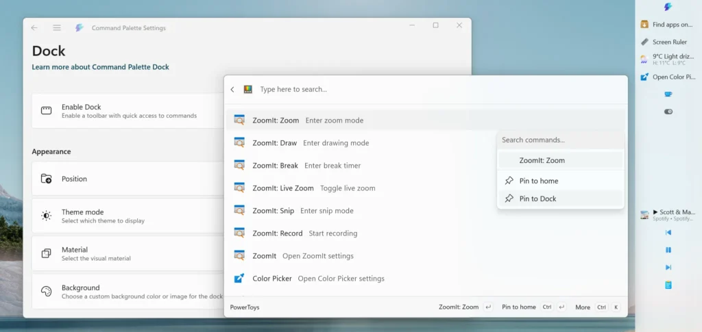
How This Impacts Productivity
Now let’s get practical. Does this actually help you work better?
Faster Access to Apps
Since icons stay centered and consistent, I find apps faster. My muscle memory adapts quickly.
Cleaner Workspace
A minimal interface reduces distractions. I focus more on tasks instead of UI elements.
Better Multitasking
Visual indicators and smoother transitions help me switch between apps without confusion.
What Still Needs Improvement
I like the new design, but it is not perfect.
Limited Customization
Windows 10 allowed more flexibility. In Windows 11:
- You cannot move the taskbar to the top or sides easily
- Some advanced tweaks are missing
This frustrates power users.
No True Dock Features Yet
Let’s be honest. This is not a full dock yet.
For example:
- No magnification effect like macOS
- Limited drag-and-drop behavior (though improving)
- Fewer animation customizations
Microsoft still plays it safe.
Missing Advanced Controls
Some users miss:
- Detailed toolbar options
- Full right-click customization
- Legacy features
Microsoft simplified the interface, but that came at a cost.
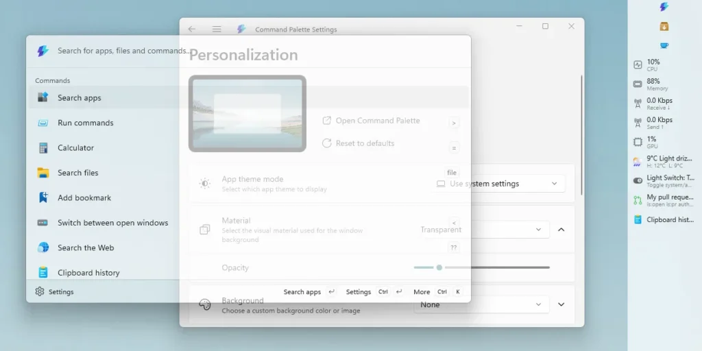
Comparison: Windows 11 Dock vs macOS Dock
Let me break this down simply.
| Feature | Windows 11 Taskbar | macOS Dock |
|---|---|---|
| Centered icons | Yes | Yes |
| App pinning | Yes | Yes |
| Magnification effect | No | Yes |
| Custom placement | Limited | Flexible |
| Animation depth | Moderate | Advanced |
| Touch optimization | Better | Limited |
My take:
Windows 11 offers a practical dock experience. macOS still leads in polish and customization.
How to Customize Your “Dock” in Windows 11
Even with limitations, you can tweak it.
Change Alignment
- Go to Settings
- Click Personalization
- Select Taskbar
- Change alignment to left or center
Pin or Unpin Apps
- Right-click any app
- Select “Pin to taskbar”
Adjust Taskbar Behavior
You can tweak:
- Auto-hide
- Icon grouping
- System tray settings
These small changes help personalize your workflow.
Should You Use Third-Party Dock Apps?
Some users want a “true dock” experience. That’s where third-party tools come in.
Popular options include:
- Nexus Dock
- RocketDock (older but still used)
- TaskbarX
But I recommend caution.
Third-party tools can:
- Affect performance
- Break after updates
- Create security risks
Unless you really need advanced features, the built-in system works well.
The Bigger Picture: Where Windows Is Heading
This dock-like taskbar signals something bigger.
Microsoft is slowly modernizing Windows.
We see this in:
- Rounded corners
- Fluent design
- Simplified menus
- AI integration in newer builds
The dock-like taskbar is part of this transformation.
Windows no longer tries to be everything at once. It focuses on clarity and usability.
Real-World Use: My Experience
After using Windows 11 daily, I noticed a few things:
- I rely more on pinned apps now
- I switch tasks faster
- My screen feels less cluttered
But I also miss some advanced controls from Windows 10.
So, it feels like a trade-off.
You gain simplicity. You lose some flexibility.
Is This Change Good or Just Cosmetic?
Some people argue this is just visual.
I disagree.
Design affects behavior.
When an interface becomes simpler:
- You think less about navigation
- You focus more on tasks
- You make fewer mistakes
That’s real productivity improvement.
Final Thoughts
Windows 11 may not officially have a dock, but in practice, it behaves like one.
Microsoft redesigned the taskbar to match modern user expectations. It feels cleaner, faster, and more intuitive.
At the same time, it still lacks the depth and flexibility of a true dock system.
If you value simplicity, you will enjoy it.
If you prefer full control, you may feel limited.
For me, it strikes a decent balance. And honestly, it shows that Windows is finally evolving in the right direction.
Sources
- Microsoft Design Principles
https://learn.microsoft.com/windows/apps/design/ - Microsoft Fluent Design System
https://learn.microsoft.com/windows/apps/design/style/fluent-design-system/ - Windows 11 Overview
https://www.microsoft.com/windows/windows-11
